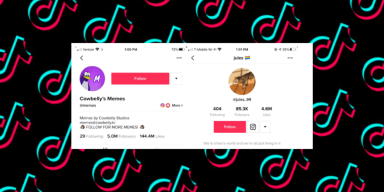
TikTok, one of today’s most popular social media applications, has started testing a new design for its profile pages. However, this design is very familiar to us. It looks very similar to Instagram’s profile page design.
As you know, TikTok is one of the most popular social media platforms today. So much so that it is the most downloaded application in the App Store last year. It is also in a quite good position on the Google Play Store.
The serious rivalry between TikTok and Instagram is a well-known fact. These applications sometimes add each other’s features to their own applications. This happened again and TikTok started testing Instagram’s profile page design in its own application.
TikTok’s Instagram-like new design was shared on Twitter by New York Times employee Taylor Lorenz.
Looks like TikTok is redesigning user profiles to look almost exactly like Instagram (new design vs old) pic.twitter.com/uQAHPwaZoh
— Taylor Lorenz (@TaylorLorenz) February 3, 2020
After Taylor’s post, TikTok officials have confirmed that they have tested a new profile page design and stated that they keep working to improve the user experience.
However, the authorities did not explain when they will present the new design to users. What do you think?
Don’t forget to check out the other Mobile Marketing News and share your comments with us in the comment section below.


One Ping
Pingback:TikTok Revenue and Usage Statistics (2020) | Mobile Marketing Reads