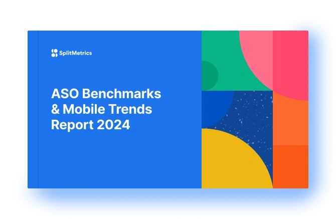
In the competitive landscape of mobile apps, small design tweaks can yield significant results. According to a recent study by SplitMetrics, optimizing app icons can lead to a substantial increase in user numbers, with some apps experiencing up to a 25% boost in downloads. The study highlights how seemingly minor adjustments, such as simplifying icon backgrounds, can have a profound impact on conversion rates.
The SplitMetrics study, which forms part of their ASO Benchmarks & Mobile Trends Report 2024, analyzed nearly 200 apps and conducted over 3,500 A/B tests across Google Play and the Apple App Store. One of the key findings was that app icons with clear and simple backgrounds achieved a 26% higher conversion rate compared to those with more cluttered designs. This suggests that users are more likely to engage with apps that present a clean and straightforward visual appeal.
The report also uncovered regional preferences, particularly in the Chinese market, where apps featuring red branding saw a 5% advantage in conversion rates. This insight underscores the importance of tailoring app design to specific cultural contexts.
Moreover, the study found that certain app categories can benefit from specific design strategies. For instance, finance apps that use bold colors in their icons and screenshots can achieve a 12% increase in conversion rates. Shopping apps, on the other hand, see a notable rise in conversions—up to 14%—when they incorporate seasonal elements into their App Store Optimization (ASO) during holidays and special events.
Max Kamenkov, CEO and co-founder of SplitMetrics, emphasized the significance of these findings for app developers and marketers. “Our research shows that what might seem like a minor design choice, such as the color or layout of an app icon, can have a critical impact on an app’s success in the marketplace. It’s essential to continually test and refine these elements to stay competitive,” Kamenkov explained.


Comments
Loading…